As with any component of a game engine, a UI system should follow the architecture of the engine its built for. In my previous post I discussed how I implemented an OOP-based UI framework for the BUas Educational Engine (BEE), and while the system was solid, XAML turned out to be a bad fit.
Continuing my studies in Creative Media and Game Technologies at Breda University of applied sciences, I decided to reiterate the UI system to better fit the engine’s ECS-based design. In this post I will discuss some interesting bits about the improvements I made.
Issues with the previous version
When implementing the first version of the UI framework, I was focused on implementing a subset of XAML specifically. I did this because XAML was the best UI framework I could find that has been widely adopted and supported in many different games. However, during the project I found that this was not the best approach for a few reasons:
- XAML is a very complex system that is difficult to implement even a subset of.
- XAML is OOP-based, which is not a good fit for an ECS-based engine.
- XAML is designed for C#; the programming paradigm and language features it uses are wildly foreign to C++.
- Using XAML in BEE is like eating soup with an excavator: it’s vastly overkill for such a simple engine.
These reasons, among some less important ones, made the implementation much harder than it needed to be and resulted in an incomplete, unergonomic and unwieldy framework. The second iteration aims to solve these issues by taking a different approach right from the start.
ECS-based framework
The new system is based on the Entity Component System architecture that BEE uses. This means that UI components are actually components, instead of (OOP) objects. This new data-oriented framework is a much better fit with the rest of the ECS-based engine.
When using the XAML approach, an UI element could only be a single type of object. This meant that a Button also had to implement and manage layout properties, styling, text, etc. even if not all button elements use these properties. Inheritance was used to solve this, but this made the system very rigid and hard to extend. It also didn’t make the arrangement and rendering of the UI any easier, obfuscating what elements cared about what and where functionality was actually implemented.
Adopting the component-based design that the rest of the engine uses, the framework becomes a lot more flexible and extensible, favouring composition over inheritance. Each component only needs to worry about relevant properties, and multiple separated systems can be used to handle the different aspects of the UI:
The old system (left) vs the new system (right)
In the new system, an UI element is a collection of components. This means that a designer can add just the components they need to an element, not having to deal with irrelevant properties or unwanted functionality:
name: root
layout: # Layout component
  width: 100%
  height: 100%
children:
  - text-block: # TextBlock component
      text: "Hello world!"
      font-size: 30
    style: # Style component
      foreground: "#ffff00"
Exceptions to this rule are the components that provide position and layout related properties, which are required for every UI element. This is because they are needed to render and arrange elements correctly.
It is also easier for programmers to add new functionality to the system, as they can just add a new component or system that implements the functionality they need without having to maintain unrelated code.
Markup language
As you can see in the example above, the new system uses YAML for defining the UI, instead of X(A)ML. I made this choice based on the following reasons (among others):
- YAML is much more concise and readable than XML, which was designed to be easy to read and write for machines, not humans.
- YAML is less complex than XAML, which makes it easier to implement and understand.
- YAML is easier to learn and use than XML, which makes it more accessible to designers and programmers alike.
- YAML lends itself well to defining component-based hierarchies
Using JSON was another option I considered, but I since they can do pretty much the same as YAML, I decided to go with YAML because it has a less verbose and more flexible syntax. This makes it easier to write and read, especially for designers who may not be familiar with programming languages.
To illustrate the difference, here is a comparison between the old and new markup defining the same interface: (Drag the slider to see the difference)
<Page
    xmlns="http://schemas.microsoft.com/winfx/2006/xaml/presentation"
    xmlns:x="http://schemas.microsoft.com/winfx/2006/xaml"
    xmlns:d="http://schemas.microsoft.com/expression/blend/2008"
    xmlns:mc="http://schemas.openxmlformats.org/markup-compatibility/2006"
    mc:Ignorable="d">

    <Grid HorizontalAlignment="Stretch" VerticalAlignment="Stretch">
        <Grid.RowDefinitions>
            <RowDefinition/>
            <RowDefinition/>
            <RowDefinition/>
        </Grid.RowDefinitions>
        <Grid.ColumnDefinitions>
            <ColumnDefinition/>
            <ColumnDefinition/>
            <ColumnDefinition/>
        </Grid.ColumnDefinitions>

        <!-- inventory -->
        <StackPanel Name="AmmoIcons" Grid.Row="0" Grid.Column="0"
                    Margin="20" Spacing="20" Orientation="Horizontal">
            <Image Background="assets://HUD/frame.png" Padding="10" Width="130" Height="130" />
            <Image Background="assets://HUD/frame.png" Padding="10" Width="130" Height="130" />
            <Image Background="assets://HUD/frame.png" Padding="10" Width="130" Height="130" />
        </StackPanel>

        <!-- compass -->
        <Image Name="CompassImage" Grid.Row="0" Grid.Column="1"
               HorizontalAlignment="Center" Margin="0,10,0,0"
               Source="assets://HUD/compass.png" />

        <!-- objective -->
        <Grid Grid.Row="2" Grid.Column="0" VerticalAlignment="Bottom" Margin="20" Width="500">
            <Grid.RowDefinitions>
                <RowDefinition/>
                <RowDefinition/>
            </Grid.RowDefinitions>

            <TextBlock Grid.Row="0"
                       Margin="5,0,0,-35" Padding="15,10,0,15"
                       Background="#b0ff0000"
                       Name="ObjectiveText">
            </TextBlock>

            <Image Grid.Row="1" ZIndex="1" Source="assets://HUD/frame_bottom.png" />
        </Grid>

        <!-- health -->
        <StackPanel Grid.Row="2" Grid.Column="2" Margin="10" Spacing="0"
                    HorizontalAlignment="Right" VerticalAlignment="Bottom"
                    Orientation="Horizontal" Name="HealthIcons">
            <Image Source="assets://Icons/health.png" Width="130" />
            <Image Source="assets://Icons/health.png" Width="130" />
            <Image Source="assets://Icons/health.png" Width="130" />
            <Image Source="assets://Icons/health.png" Width="130" />
            <Image Source="assets://Icons/health.png" Width="130" />
        </StackPanel>
    </Grid>
</Page>
name: HUD
layout: { flex: 1, align-self: stretch }
grid: { rows: [auto, auto, auto] }
children:
  # inventory
  - cell: { column: 0, row: 0 }
    layout: { margin: 20}
    stack-panel: { spacing: 20, orientation: horizontal }
    children:
      - image: { background: "assets://HUD/frame.png", width: 130 }
        layout: { padding: 10 }
      - image: { background: "assets://HUD/frame.png", width: 130 }
        layout: { padding: 10 }
      - image: { background: "assets://HUD/frame.png", width: 130 }
        layout: { padding: 10 }

  # compass
  - cell: { column: 1, row: 0 }
    image: { source: "assets://HUD/compass.png" }
    layout: { align-self: center, margin-top: 10 }

  # objective
  - cell: { column: 0, row: 2 }
    grid: { rows: [auto, auto] }
    children:
      - name: "ObjectiveText"
        cell: { column: 0, row: 0 }
        layout: { margin: [5, 0, 0, -35], padding: [15, 10, 0, 15] }
        text-block:
          foreground: "#ffff00"
          font-size: 30
          font-weight: bold

      - cell: { column: 0, row: 1 }
        image: { source: "assets://HUD/frame_bottom.png" }

  # health
  - name: "HealthIcons"
    cell: { column: 2, row: 2 }
    layout: { margin: 10, align-self: flex-end }
    stack-panel: { orientation: horizontal }
    children:
      - image: { source: "assets://Icons/health.png", width: 130 }
      - image: { source: "assets://Icons/health.png", width: 130 }
      - image: { source: "assets://Icons/health.png", width: 130 }
      - image: { source: "assets://Icons/health.png", width: 130 }
      - image: { source: "assets://Icons/health.png", width: 130 }
When first implementing UI loading from YAML, it was immediately much easier than supporting XAML, and in the long run it has proven to fit the engine much better. The only downside is the lack of existing graphical editors, but hot-reloading combined with a decent in-engine inspector more than makes up for this.
Implementation
Following the ECS architecture, the new UI framework uses separate “systems” (see Entity Component System) to handle the different aspects of the UI. This means that the arranging and rendering of UI elements, the user input and all other functionality is handled by separate classes that can be registered with the engine. This makes it easier to extend and maintain the system, as each system can be developed and tested independently:
Engine.RegisterSystem<ui::InterfaceArranger>();
Engine.RegisterSystem<ui::InterfaceMouseInputHandler>();
Engine.RegisterSystem<ui::InterfaceKeyboardInputHandler>();
Engine.RegisterSystem<ui::InterfaceControllerInputHandler>();
Layout
Before any rendering or input handling can be done, the UI elements need to be measured and arranged. This is done by the layout system, which is responsible for calculating the size and position of each UI element based on its properties and the properties of its parent elements.
Though it is feasible to implement your own layout calculations, as I have done previously, it is very difficult to get right and provides few added benefits. This is why I decided to use an external library (Yoga in this case) to handle the layout calculations. All the properties of the layout component are simply translated to Yoga properties, and the library takes care of the rest. This makes it much easier to implement and maintain the layout system, as I don’t have to worry about the details of the calculations.

Rendering
After the layout system has calculated the size and position of each UI element, the rendering system is responsible for drawing the elements on the screen. This is done top-down, meaning that the parent elements are drawn first, and then the child elements are drawn on top of them. This is important for the correct rendering of overlapping elements, as the last element drawn will be on top:
The rendering process (on DirectX 12)
Alongside the development of this framework, I helped develop a platform-agnostic rendering API for BEE, supporting both DirectX 12 and the PlayStation 5. The implementation details of this API are not relevant to this post, but it is worth mentioning that this means that there is only one rendering system to maintain for all platforms.
The rendering code in this system is similar to the code in the old renderer, but it is much more modular and easier to modify or extend, partly because of the components, as well as our graphics API.
Font rendering
Though the new UI framework has pretty much the same rendering capabilities as the old one, one big visual improvement is its new text rendering. Instead of using bitmaps as usual, the new renderer does its font rendering using signed distance fields (SDFs).
Instead of rendering glyphs using bitmaps, we generate a font atlas of SDFs, for every pixel storing the distance to the nearest edge of the glyph. This allows us to greatly scale the text without losing quality, as the SDFs can be sampled at any resolution.
SDF fonts are too complex to explain well in this post. I learned about the technique from an article by Red Blob Games, and I recommend reading it if you’re interested in the details.
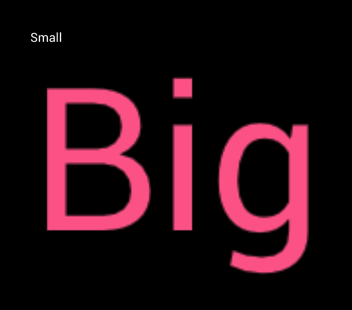
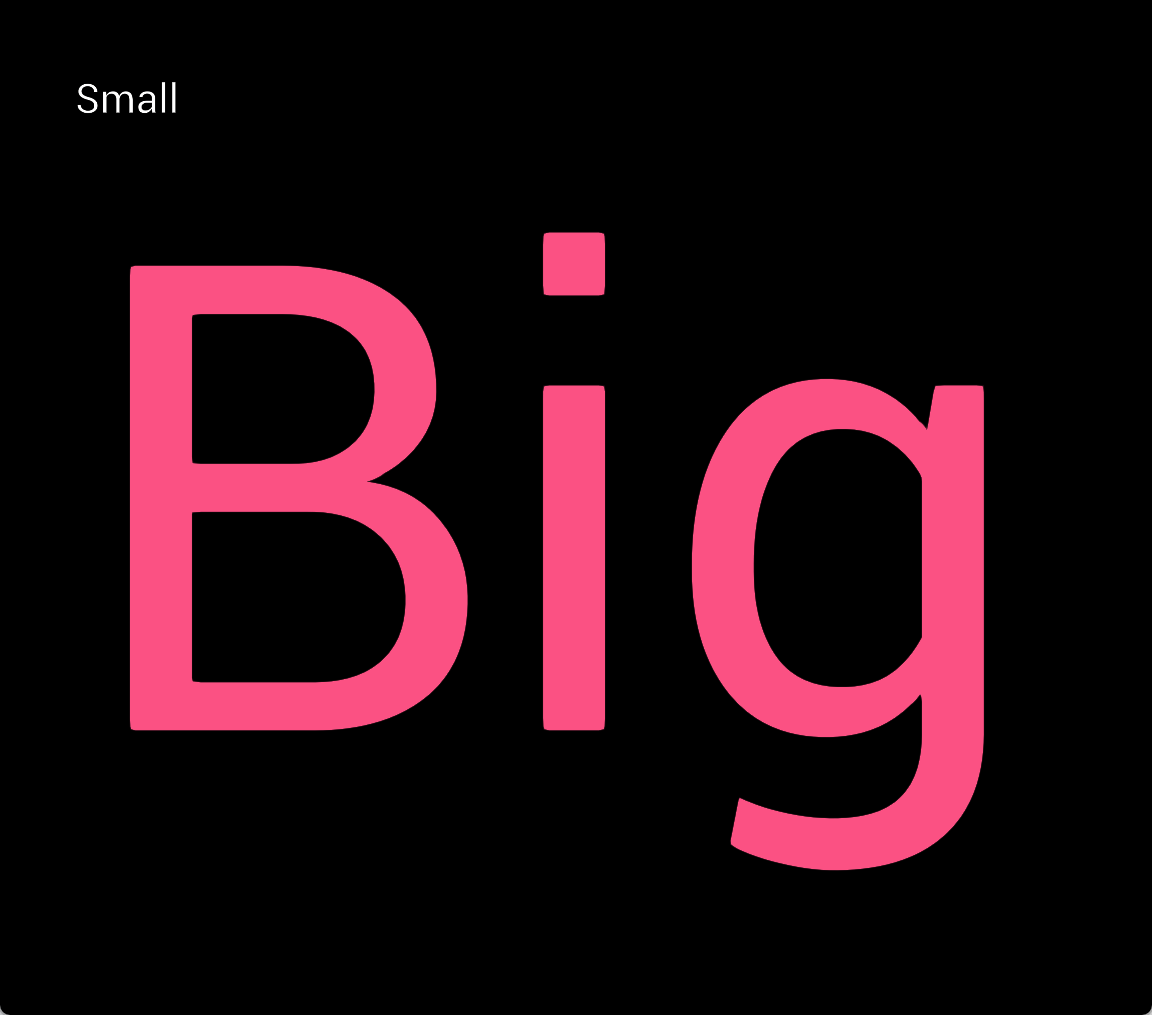
I’m using msdf-atlas-gen to generate four-channel MSDFs, and when rendering the characters with updated shaders they are much sharper than when using a normal bitmap font, and scale much better:


Bitmap font (left) vs four-channel MSDF font (right)
User input
User input is more complex from a code design perspective, as it needs to support multiple input devices (mouse, keyboard, gamepad, etc.) in any way a UX designer might want. This is again solved by splitting the functionality into multiple systems, each handling a specific type of input.
This means that a MouseInputSystem, KeyboardInputSystem, GamepadInputSystem, etc. can all operate on the same UI components without having to worry about each other. Another system responsible for tracking UI navigation state (e.g. which element is currently focused) can then be used by these systems to navigate between elements and interact with them:
UI navigation using mouse, keyboard and gamepad
Conclusion
Moving from OOP and XAML to this new ECS-based architecture was definitely a good move. The new system is much easier to use and maintain, and the separation of concerns makes it easier to extend and add new functionality. The use of YAML instead of XAML also makes it much easier to work with, making it more accessible to designers and programmers alike.
During the development of this project, two other teams of students ended up using the framework in their engines, which was a great validation of the design choices I made. Receiving live feedback on all aspects of the framework was very helpful, and it shows that the system is flexible enough to be used in different engines and projects.
It is too bad that I didn’t have the time to take this UI framework to the next level, but it was very interesting to reiterate on a project like this. I’m looking forward to seeing what else I can do with UI programming in the future.

