
Well-designed user interfaces in video games are crucial for crafting a good experience; they facilitate communication and interaction with the player. It is therefore important, as an engine developer, to empower UI designers as much as possible by providing them with the tools they need to create the best possible interfaces.
As part of my 2nd year studies in Creative Media and Game Technologies at Breda University of applied sciences, I have been developing a UI framework for the BUas Educational Engine (BEE) in C++ to do just this. And in this blog post, I will be sharing some interesting bits of how I did it.
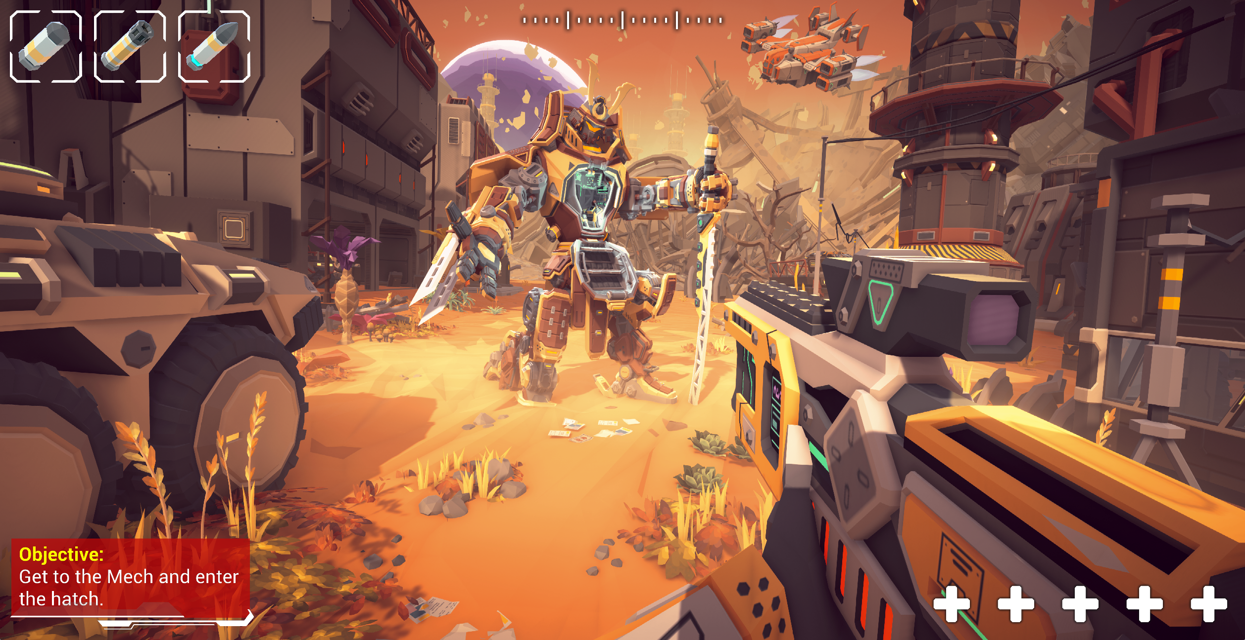 A demo UI for an FPS game made with the XAML framework
What do we want to give to the UI designers?
Before we dive into the challenges, let’s first take a look at what we actually want to make. The goal of this project is to provide a feature-rich user interface framework. It also aims to provide the tools to easily and rapidly create and iterate on UI designs without having to write code or deal with the technical details of the engine.
The are a bunch of existing solutions for this, like Unity’s, and Godot’s UI system and Unreal’s UMG. All of these are great tools, but they all require a full-fledged UI editor besides the framework itself. This greatly increases the complexity and effort required to develop and maintain the system. Instead, we want to use an existing authoring tool to develop the UI and only worry about making it work in the engine.
An excellent example of this, and the tool we are using, is XAML. XAML is an XML-based markup language developed by Microsoft for creating user interfaces. It is used in most Windows applications, as well as some other open-source and commercial projects like Avalonia and NoesisGUI. It has a rich set of features that make it perfect for our use case, as well as excellent documentation.
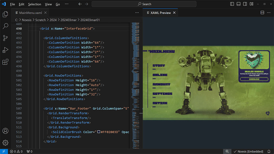 XAML used with NoesisGUI (source)
Objects and Properties
Before we parse or render anything we need a few core components for our XAML framework: DependencyObjects and DependencyProperties. These are the building blocks of XAML and are used to define the types and attributes of the UI elements.
Normally, these are implemented in C# using the .NET framework, but we are using C++ and the BEE engine, making things a lot more challenging. We have no access to fancy language features like runtime reflection and working between different types is a lot harder.
Our solution is a DependencyProperty class that handles as much of those non-builtin features as possible: registering the property, its name and its type, conversion, validation and keeping track of value changes:
template <typename OwnerT, typename PropertyT>
class DependencyProperty
{
We use it as a wrapper around normal member variables in our DependencyObject subclasses:
class MyObject : public DependencyObject
{
    static DependencyProperty<MyObject, int> SizeProperty;

    int Size() const { return SizeProperty.GetEffectiveValue(this); }
    void SetSize(int value) { SizeProperty.SetEffectiveValue(this, value); }
This process becomes a lot easier and more readable with some specialized subclasses and a macro or two:
// declaration
class TextBlock : public Control
{
public:
    _PROPERTY_DECL(Run, StringProperty,     Text);
    _PROPERTY_DECL(Run, StringProperty,     FontFamily);
    _PROPERTY_DECL(Run, FontWeightProperty, FontWeight);
    _PROPERTY_DECL(Run, FontStyleProperty,  FontStyle);
    _PROPERTY_DECL(Run, DoubleProperty,     FontSize);
    _PROPERTY_DECL(Run, ColorProperty,      Foreground);
};

// implementation
_PROPERTY_IMPL(Run, StringProperty,     Text,       "");
_PROPERTY_IMPL(Run, StringProperty,     FontFamily, "Roboto");
_PROPERTY_IMPL(Run, FontWeightProperty, FontWeight, FontWeight::Normal);
_PROPERTY_IMPL(Run, FontStyleProperty,  FontStyle,  FontStyle::Normal);
_PROPERTY_IMPL(Run, DoubleProperty,     FontSize,   32.0);
_PROPERTY_IMPL(Run, ColorProperty,      Foreground, vec4(1.f));
This way, we can easily define and use properties in our UI elements, and the framework can handle the rest. Value change notifications, parsing and validation can also be added to these properties.
Rendering
Rendering the UI is conceptually simple and happens in three steps:
- Measure the size of the UI elements,
- Arrange the elements in the correct position,
- Render the elements to the screen.
Each of these steps can be cached to improve performance, but we’ll keep it simple for now and recalculate everything every frame, avoiding the need for complex caching and invalidation logic.
1. Measuring
When measuring the size of UI elements, each element is asked to calculate its desired size based on its content and properties and the available size. This is done recursively, starting from the root element, but it doesn’t decide the actual size of each element, just the desired size.
When calculating this size, we take into account the content and padding of the element, as well as the constraints given by the parent element, which includes the margin:
The margin, as well as other layout attributes like max and min size, alignment and stretch all behave the same way regardless of the element’s content:
UIElement::Measure(availableSize)
{
    if (self.Visibility == Collapsed)
        return vec2(0);

    user_size = availableSize;

    // handle user-specified size
    if (!self.Width.IsDefault()) user_size.x = Width;
    if (!self.Height.IsDefault()) user_size.y = Height;

    // handle min and max size
    user_size = clamp(user_size, self.MinSize, self.MaxSize);

    // do the actual content-specific measuring
    desired_size = self.MeasureDesiredSize(user_size);

    // handle stretch alignment
    if (self.HorizontalAlignment == Stretch) desired_size.x = user_size.x;
    if (self.VerticalAlignment == Stretch) desired_size.y = user_size.y;

    return desired_size;
}
The size of the content (including the padding), however, does depend on how the element arranges its children. For example, a vertically oriented StackPanel element might measure its desired size like this:
StackPanel::MeasureDesiredSize(constraints) override
{
    desired_size = vec2(0, 0);

    for (child : self.Children)
    {
        child_constraints = constraints - desired_size - self.Padding;
        child_size = child.Measure(child_constraints) + child.Margin;

        desired_size.x = max(desired_size.x, child_size.x);
        desired_size.y += child_size.y;
    }

    return desired_size + Padding;
}
With more complex elements like Grid this can get very complicated, as sometimes the sizes of two children depend on each other. The desired size of some elements like TextBlock and Run can also depend on the available size, as they might wrap text to fit in a certain width. But this available size is not always known when measuring, and so it gets more complicated and more complicated.
In our case, we can safely assume that we won’t need to cover most of those edge cases, as we are only targeting a subset of XAML features for specifically Game UI’s. This means that we can implement a more naive solution that works well enough for most cases.
A less naive implementation from Avalonia UI (an open source C# implementation of XAML) can be found here. It covers a lot more edge cases but is also a lot more complex.
2. Arranging
After each element has figured out how big it wants to be, we arrange them in the correct position. Similar to measuring, each element is given a constraint by its parent element (which is the screen size, in case of the root). These constraints already tell the element where it is going to be placed and how big it can be, but how it fills in that area is up to the element itself.
The StackPanel element from before, for example, might arrange its children like this:
StackPanel::Arrange(constraints)
{
    start = constraints.Position + self.Padding.TopLeft;

    // elements take care of their own padding
    remaining_size = constraints.Size - self.Padding;

    for (child : self.Children)
    {
        if (child.Visibility == Collapsed) continue;

        child_size = child.DesiredSize + child.Margin;

        // the child decides where it wants to be placed, based on its alignment
        child_start = start + child.GetAlignmentOffset(remaining_size, child_size);

        // the child can now arrange its own children
        child_bounds = Rect(child_start, child_size - child.Margin);
        child.Arrange(child_bounds);

        remaining_size.y -= child_size.y;
        start.y += child_size.y;
    }
}
As you can see, elements take care of their own padding and alignment, but it is the parent’s responsibility to handle its margin and position.
3. Rendering
Finally, we render the elements to the screen. When rendering, the elements are drawn recursively in the order they appear in the hierarchy. This means that a parent is always drawn before its children, which is important for container elements with a background.
When rendering the children of an element, we first sort them by their ZIndex property, so that elements with a higher ZIndex are drawn on top of elements with a lower ZIndex. By default, this leaves the order unchanged, but allows the designer to change it if needed, making one element appear on top of another.
The complete process looks like this:
The rendering process
The final rendering of the UI is done to a separate framebuffer, which can then be drawn to the screen as a single quad. This allows us to easily apply post-processing effects to the UI, like blurring, or color correction, without affecting the rest of the scene.
User Input
The final piece of the puzzle is user input. When the user interacts with the UI, we need to know which element they are interacting with and what they are doing. Different platforms have different ways of handling this, so we abstract this away into a separate system responsible for communicating user input to the relevant elements.
One of the most important interactions we have to facilitate are button clicks:
InputHandler::HandleMouseInput()
{
    if (self.GetMouseButtonOnce(MouseButton::Left))
    {
        for (root_element : RootElements())
        {
            // recursively check what element the mouse is over (if any)
            self.heldElement = root_element.FindElementAt(self.MousePosition);

            if (self.heldElement != null)
            {
                self.heldElement.pressed = true;
                break;
            }
        }
    }
    else if (self.heldElement != null && !self.GetMouseButtonDown(MouseButton::Left))
    {
        self.heldElement.pressed = false;

        // trigger the click event
        self.heldElement.OnClick.Invoke();

        self.heldElement = null;
    }
}
From here, we can easily extend this to include OnMouseDown and OnMouseUp events. Hovering can be implemented in a similar way:
InputHandler::HandleMouseHover()
{
    if (self.MouseMoved)
    {
        hovering = false;
        for (root_element : RootElements())
        {
            // recursively check what element the mouse is over (if any)
            newHoveredElement = root_element.FindElementAt(self.MousePosition);

            if (newHoveredElement != null)
            {
                // don't retrigger events if still over the same element
                if (self.hoveredElement == newHoveredElement)
                {
                    hovering = true;
                    break;
                }

                // release the previously hovered element
                if (self.hoveredElement != null)
                {
                    self.hoveredElement.hovered = false;
                    self.hoveredElement.OnMouseLeave.Invoke();
                }

                // engage the new hovered element
                self.hoveredElement = newHoveredElement;
                self.hoveredElement.hovered = true;
                self.hoveredElement.OnMouseEnter.Invoke();

                hovering = true;
                break;
            }
        }

        // release the previously hovered element if no longer hovering
        if (self.hoveredElement != null && !hovering)
        {
            self.hoveredElement.hovered = false;
            self.hoveredElement.OnMouseLeave.Invoke();

            self.hoveredElement = null;
        }
    }
}
Controls like buttons can then easily deal with these interactions:
Button::Render()
{
    if (self.pressed) RenderBackground(self.PressedBackground);
    else if (self.hovered) RenderBackground(self.HoverBackground);
    else RenderBackground(self.NormalBackground);

    // ...
}
Other interactions like dragging and scrolling would be a bit more complex, but can be implemented in a similar way. The important part is that the input system is separate from the UI elements themselves, allowing for easy extension and customization, as well as specialization for different input methods.
Future Work
Though the framework is already quite feature-rich and more than capable of hosting complex UIs, it is still very much a subset of XAML. There are many features that are not yet implemented, like value inheritance, resources, styles, and templates, that would greatly improve the usability and flexibility of the framework.
Other than that, there are still plenty of controls missing, like sliders, checkboxes, radio buttons and scrollbars. But thanks to the extensible nature of the framework, these can be added relatively easily.
Conclusion
A demo UI for an RTS game made with the XAML framework
(Uses assets from Age of Empires by Microsoft.)
When developing a video game, few things are as important as the user interface. In this blog post, I discussed how I have developed a UI framework that allows UI designers to easily create complex and beautiful interfaces. Though the framework is still a work in progress, it is already capable of hosting complex UIs and is more than capable of handling the needs of most games. By providing the systems to support a subset of XAML, designers can easily iterate on their designs while programmers can easily implement functionality and extend the framework.
It was a challenging project, but incredibly interesting. Figuring out how to implement XAML in C++ was a great exercise in software design and architecture, and I hope that this blog post has given you some insight into how I did it.